How to Mix Colours: A Guide for Artists
 Soma Mandal Datta
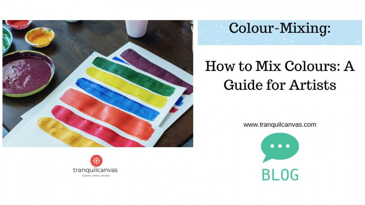
Learn how to mix colours. Discover which pigments to use to achieve the greatest range of colour mixes.
Introduction:
Colour mixing is a fascinating aspect of artistic expression that allows creators to bring their visions to life. With just a few primary colours and a touch of creativity, a whole spectrum of hues and tones can be unlocked. In this blog post, we will delve into the world of colour mixing, exploring the possibilities and potential that lie within a limited palette. Whether you're a seasoned artist or just starting out, understanding the art of colour mixing can be a game-changer in your artistic journey.
Hues of Blues
Let's begin with the blues. Ultramarine blue and Pthalo blue are two versatile choices that can be found in many artists' palettes. Ultramarine blue is considered a cooler blue, while Pthalo blue leans towards the warmer side. These blues are perfect for creating night skies, but their potential extends far beyond that. By experimenting with different blues or even mixing them with other premixed versions, such as Prussian blue, you can discover unique shades and colours that suit your artistic intentions.
To create lighter values of blue, choose a blue and add white.
For example:
PTHALO BLUE /COBALT BLUE + WHITE = LIGHT SKY BLUE OR PASTEL BLUE DEPENDING ON RATIOS
Try mixing, ULTRAMARINE BLUE and WHITE to observe how this light blue differs from the previous recipe using Pthalo or Cobalt Blue.
To mix darker blues for blueish shadows, try adding a PURPLE to it OR PAYNE’S GRAY
You can also mix darker values of other colours by adding blue to it such as adding Prussian or ultramarine blue to green to create a darker value of green.
PRUSSIAN BLUE + WHITE = POWDER BLUE TO SLATE GRAY DEPENDING ON PROPRTIONS
PRUSSIAN BLUE = ULT. BLUE = OCEAN DEEP BLUE
Fiery Reds and Pinks
Moving on to reds, Crimson is an excellent choice for creating warm and vibrant tones. It offers a cooler variation compared to vermilions and scarlets, making it ideal for different applications, especially when mixed with white. By adding a touch of black to your red mix, you can create stunning magenta rose colours that are essential for capturing skin tones. The possibilities don't end there; by introducing more white or yellow to the mix, you can achieve a wide range of pale pinks and warm orang-ey skin tones.
And there’s pinks that one can create from magenta and white pigments.
MAGENTA +WHITE = SHOCKING PINKS DEPENDING ON RATIOS AND TYPE OF WHITE SUCH AS ZINC OR TITANIUM WHITE
Gorgeous Greens
Now, let's explore the magical world of greens. By mixing lemon yellow and Pthalo blue, you can create a vibrant lime green colour. This shade is perfect for foliage shadows and can be further enhanced by adding white for highlights. By adjusting the proportions of yellow and black, you can create a variety of green tones, ranging from bright and yellow-y to darker and more muted shades. The versatility of these greens extends beyond foliage, as they can be used for painting subjects like green fruits, outfits, or even frogs. And here are 6 more colour mixing recipes for you to try for mixing a variety of green hues :
50% LEMON YELLOW + 50 % GREEN = CHARTREUSE GREEN.
PTHALO/COBALT BLUE + LEMON YELLOW + HINT OF CRIMSON RED = OLIVE GREEN.
ULT. BLUE + PTHALO BLUE+ CAD. YELLOW+LEMON YELLOW +WHITE = SEAFOAM GREEN
ULT BLUE + CAD. YELLOW = MUTED GREEN.
PTHALO BLUE + LEMON YELLOW = VIBRANT GREEN
PRUSSIAN BLUE + YELLOW OCHRE = FOLIAGE GREEN
Warm Oranges
Orange, a colour that exudes warmth and energy, can be created by mixing Crimson and lemon yellow. The resulting shade can be further adjusted by varying the proportions of these primary colours. By adding white, you can create beautiful pastel oranges that are perfect for sunset themed paintings or warm summery landscapes.
The range of orange hues is vast, and by experimenting with different recipes, you can capture the breath-taking colours of a sunset or add depth to your artwork. Try mixing Crimson with Cadmium Yellow to observe the difference in the orange recipe created with lemon yellow and crimson red.
CRIMSON + CADMIUM YELLOW = DEEP ORANGE
CRIMSON + LEMON YELOW = BRIGHT ORANCE
ADD WHITE TO ABOVE MIXES TO CREATE PASTEL ORANGES!
Vivid Violets and Purples
For violets and purples, the combination of blue and red is the key. By adjusting the amounts of each color, you can create a spectrum of hues, from bluish violets to reddish purples. Adding white to these mixtures allows for the creation of lighter tonal values, while black or Payne's gray can deepen the shades. Violets and purples are versatile colors that can be used in various contexts, from under-painting to complementing cool and warm colors in a painting. They can also be used to represent shadows in paintings instead of darker values of a colour.
MAGENTA + ULTRAMARINE BLUE = BRILLIANT PURPLE
CRIMSON + ULTRAMARINE BLUE = DEEP PURPLE
Conclusion:
The art of colour mixing is not limited to specific recipes or formulas. It is an intuitive and experimental process that encourages artists to explore and discover their own colour combinations.
By playing with the proportions of primary colours and adding white and black, the possibilities become infinite. As you gain experience and confidence, you will develop a keen eye for mixing colours that perfectly match your artistic vision. After all practice makes perfect right!
Colour mixing is a fundamental skill that empowers artists to create captivating and harmonious compositions. By understanding the characteristics of different primary colours and exploring their interactions, you can unlock the potential of a limited palette. Through experimentation and practice, you will develop a deep understanding of colour relationships and the ability to mix an infinite range of hues and tones.
So, embrace the art of colour mixing, let your creativity flow, and enjoy the journey of discovering the endless possibilities that lie within your palette.
Happy painting!

Categories: : Acrylic Painting, Beginners Guide, Colour Mixing
