8 Essential Tips for Using Limited Palette in Abstract Painting
 Soma Mandal Datta
Unlock the secrets of using a limited palette. Discover 8 essential tips for achieving harmony, depth, and expressive art through colour.
As an artist, have you ever considered using a limited palette method in your abstract paintings? By restricting the number of colours you use on your canvas, you can create a harmonious artwork that is visually unified. However, this technique requires a proper understanding of colour theory and colour mixing. In this article, we will provide you with eight essential tips for using a limited palette method in abstract painting.
Starting with the basics of the colour wheel, we will guide you through the steps of creating a balanced colour harmony. You will learn how to create the illusion of depth and establish a focal point using a limited range of colours. We will also share helpful techniques for mixing colours and avoiding muddy results. Whether you want to experiment with a monochromatic colour scheme or explore the possibilities of complementary colours, this guide has got you covered. Read on to discover the secrets of creating captivating abstract art with a limited palette.

Introduction
As a painter, you know that the use of colour greatly affects the overall impact of your artwork. However, sometimes the abundance of options can be overwhelming and lead to indecision or lack of focus in your work. That’s where limited palettes come in. Often used in abstract painting, limited palette technique involves using only a few colours to create a coherent and impactful composition. While seemingly simple, it requires careful planning and knowledge of colour theory to achieve the desired effect.
In this blog post, we will discuss 8 essential tips for using a limited palette in abstract painting. By following these tips, you will be able to create vibrant and engaging compositions that stand out amongst your body of work. From understanding the importance of value and temperature in colour selection to experimenting with different texture techniques, we will provide you with everything you need to know to take your limited palette abstract painting to the next level. So, whether you are a seasoned artist or just starting out, read on to discover the tips and techniques to paint abstracts using colour schemes that are simple to conceptualize and develop as you build your masterpiece.
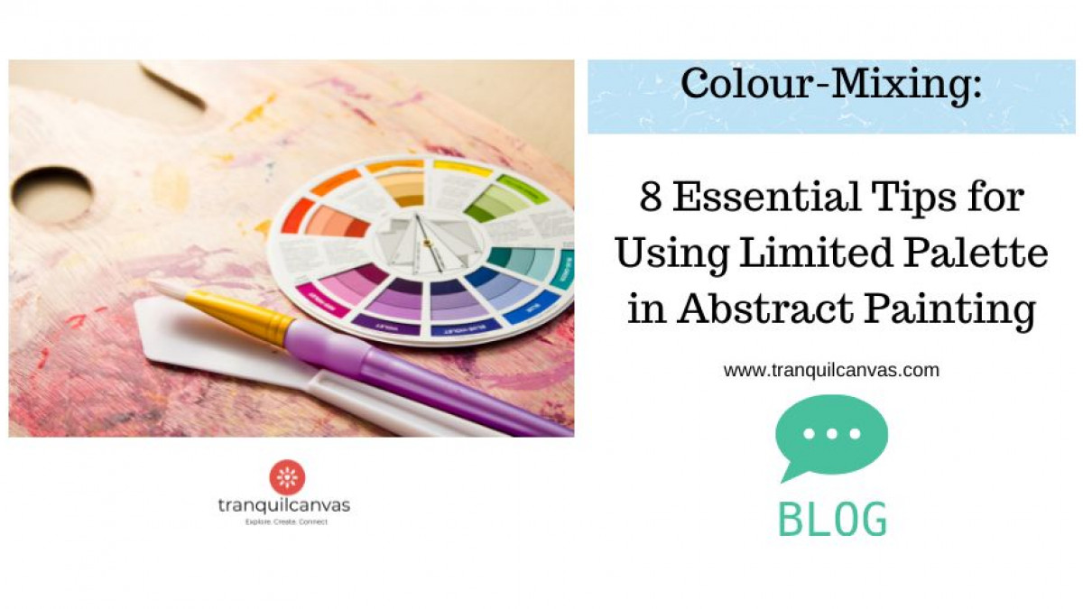
1. Consider the Colour Wheel : Understanding the relationship between colours is key to using a limited palette.

Learning about colour and understanding the relationship between colours is of paramount importance when it comes to employing a limited palette. In this context, the colour wheel serves as a critical tool for any paint artist or graphic designer. If you have never used this tool before and don't know what it is, then here's the information:
The colour wheel depicts a full spectrum of colours arranged in a circle and is a visual representation of how colours relate to each other. By utilizing the colour wheel, an artist can select colours that complement and work well together, which in turn, creates harmony and balance within the artwork or design. It also assists in creating contrast, which can produce eye-catching visual effects and add depth and dimension. When working within a limited palette, an understanding of the colour wheel guarantees that each colour selection adds to the overall visual appeal of the finished piece and creates a professional and sophisticated effect. This handy tool is relevant and applicable for artists using any paint medias such a acrylic, oil, watercolours or paint pens. If you are a beginner and need a visual guide for colour selection or colour mixing then you will need to learn how to use the colour wheel.
Since, the colour wheel is a tool that displays the relationships between different colours, it can be used to guide decisions on colour mixing and colour combinations, it's a perfect tool to plan colour schemes for abstracts from simple monochrome colour schemes to bold and bright analogous or triadic schemes without the risk of muddy colours. This means that artists can create remarkable works of art using only a few carefully chosen colours. By using a limited palette, artists are forced to be inventive with their colour choices and can create striking compositions. Exploring the possibilities of using a restricted range of colours can lead to exciting, expressive art.
2. Choose Colours Wisely - select colours that complement each other and create a harmonious look

When working with a limited palette in abstract painting, it's important to choose colours wisely or at least with some level of planning and experimentation. The right combination of colours can help create a harmonious look, while the wrong ones can create a disjointed and cluttered appearance. The colour wheel, offers a sneak preview into the world of colour including a visual representation of how colours complement each other. For instance, complementary colours sit opposite each other on the wheel, and when used together, they can create a dynamic and engaging visual effect. You can choose any of the options from the complementary colour sets to pre-mix and experiment with colour swatches prior to starting your painting. That way, when you are in the creative zone, you will minimise the chances of muddy, dull colours enabling you to enjoy an immersive painting process.

Additionally, it's important to understand the basic principles of colour theory and how colour mixing works to create a desired mood or effect. Colour theory is the study of how colours interact with each other. It is based on the colour wheel, which is a circle of colours that are arranged in a specific order. The three primary colours are red, blue, and yellow, which cannot be created by mixing any other colours. The three secondary colours are orange, green, and purple, which are created by mixing two primary colours together. Tertiary colours are created by mixing a primary colour with a secondary colour.

Colour mixing works by combining different colours to create a new colour. Mixing two primary colours together will create a secondary colour. Mixing a secondary colour with a primary colour will create a tertiary colour. Combining different colours can create a variety of tones, shades, and tints.

By using these tools and techniques, you can create expressive art with a limited palette that is both visually pleasing and emotionally impactful.
3. Test Out Different Shades - Explore different hues and shades to create the desired effect.

When working with a limited palette in abstract painting, it is crucial to test out different shades in order to achieve the desired effect. One should understand that the number of colours may be limited, but this does not mean that every colour is interchangeable. Thus, playing around with different hues and shades becomes important. It is recommended to refer to the colour wheel and apply the theories of colour mixing and colour theory to create more variety within the chosen palette. By testing out various shades, artists can better understand the potential of their colour palette and how to use it to create expressive art that is both visually appealing and meaningful. Therefore, exploring different colours is essential when working with a limited palette, as it allows for more experimentation and creativity in the abstract painting process.
4. Create Depth - Use light and dark shades to create depth and contrast
Learn how to create light and dark hues of a hue by simply adding black and white to your colour recipes. Adding black creates 'shades' of a hue and adding white pigment results in 'tints' of a hue. Using these enables you to create depth and contrast in any painting from realistic still-life to abstract paintings.
When working with a limited palette in abstract painting, creating depth and contrast is essential to bringing your artwork to life. One way to achieve this is by using light and dark shades to create visual interest within your composition. By selecting colours on opposite ends of the colour wheel, you can create sharp contrasts that draw the viewer's eye and make your artwork visually stimulating. Understanding colour theory and colour mixing techniques can be helpful in selecting the right shades and creating your desired effect. This approach can be especially effective in expressive art where emotions and ideas can be communicated through colour and contrast. As you work with limited palettes in your abstract painting, experimenting with light and dark shades can add a level of sophistication and depth to your artwork.
5. Balance the Paintings - Try to use colours and shapes that will balance the composition
Using limited palette in abstract painting can be an effective technique for creating a cohesive and harmonious composition. One of the key components of creating such a composition is balancing the paintings with colours and shapes. This requires careful consideration of the placement and distribution of each element within the artwork. To accomplish this, artists can use the principles of colour theory and the colour wheel to guide their decision-making process when selecting colours. By understanding how different colour combinations can create balance and harmony, artists can make informed choices that contribute to the overall mood and aesthetic of their work.
Additionally, skillful colour mixing techniques can help to create nuanced and expressive art with a limited set of colours. Overall, balancing the paintings is an essential component of abstract art that requires a deep understanding of colour theory and artistic technique.
6. Balance colour Tones - use a mix of warm and cool colours to create visual interest

One of the most essential tips for using a limited palette in abstract painting is to achieve a balance of colour tones. Balancing warm and cool colours in your artwork can add visual interest and depth. To attain this balance, it is helpful to refer to the colour wheel and apply colour theory. Warm colours like reds, oranges, and yellows are vibrant and tend to advance in a composition, while cool colours like blues, greens, and purples have a receding effect. By incorporating a mix of warm and cool colours, you can bring harmony and equilibrium to your artwork.
Mastering colour mixing is also crucial for creating a well-balanced palette. Take the opportunity to experiment with different colour combinations and discover the right mix of colours that will achieve the desired effect in your expressive art. By applying these principles, you can create a harmonious and visually intriguing composition while embracing the limitations of a limited palette.
7. Consider how colours can be used to convey a certain mood or message
Consider how colours can be used to convey a certain mood or message. As an artist, I understand the power of colour in influencing emotions and perceptions. Different colours hold distinct meanings and associations, and it is essential to select them thoughtfully when aiming to communicate a specific mood or message. For instance, warm tones like red and orange convey energy and excitement, while cool tones like blue and green have a calming and soothing effect. Taking cultural connotations into account adds another layer of depth and ensures that the message resonates across different regions. Therefore, careful consideration of colour selection is crucial to enhancing the mood of the audience and effectively conveying the desired message.

In my own abstract painting practice, I have discovered that working with a limited palette often leads to more focused and expressive art. Once I choose the key colour for my painting, I refer to the colour wheel as a guide to understanding colour relationships. Experimenting with complementary colours creates bold contrasts, while exploring analogous colour schemes results in harmonious compositions with subtle transitions in hues. The process of trying different combinations can lead to unexpected and exciting results. By employing colour theory as a guiding principle, I am able to create powerful and expressive abstract paintings, even within the constraints of a limited palette.
Understanding the potential of colour and its ability to convey meaning is a valuable skill for any artist. By exploring the world of colour and its applications in abstract painting, we can unlock new avenues for creative expression and deepen the impact of our artwork.
Achieve Freedom and Unique artistic expressions through limited palette abstract painting
Limited palette abstract painting allows for a great deal of creative freedom and unique artistic expression. By using only a few colours, an artist is forced to focus on the relationships between those colours and how they interact with each other on the canvas. This can lead to unexpected and exciting results that may not have been possible with a full range of colours.
There's nothing more frustrating than being in the state of flow while painting an abstract and accidentally mixing muddy colours. But if you understand colour mixing basics as applied to limited palette method, then muddy colours can be avoided or created intentionally if and when needed as part of your colour scheme. However, by using a limited palette can allow an artist to focus more on the expressive qualities of their work. When there are fewer colours to worry about, an artist can concentrate on the textures, shapes, and gestures they are creating with their brushstrokes, resulting in a more emotive and visceral artwork.
Overall, limited palette abstract painting offers a unique opportunity for artists to explore new avenues of creativity and expression through the restriction of colour.
64756a0e9657e_lg.jpg)
Colour Mixing Course for Absolute Beginners
Mastering the art of colour mixing is a crucial skill for any painter, whether you work with acrylics, oils, or watercolours. Understanding how colour theory works and how to effectively mix colours opens up a whole new world of possibilities, allowing you to create depth, harmony, and vibrancy in your artwork. If you're ready to take your colour mixing skills to the next level, I highly recommend enrolling in our online colour mixing course, "The Art of Mixing Colours: Unlocking the Secrets of a Limited Palette."
In this comprehensive online course, you will learn how to mix primary colours with confidence, explore colour theory fundamentals, uncover tips and tricks to avoid muddy colours, learn an easy to recall method for using the colour wheel, and discover the power of using a limited palette. The course contains step-by-step video lessons, demonstrating various techniques, simple colour mixing tutorials and exercises that will enhance your understanding of colour mixing, enable you to mix vivid new colours and strengthen your colour-mixing skills. You'll also gain access to downloadable resources and practical exercises to reinforce your learning.
By purchasing the colour mixing course, you'll receive lifetime access (terms and conditions apply) to the course content, allowing you to learn at your own pace and revisit the material whenever you need a refresher. Plus, you'll become part of a supportive community of fellow artists, where you can exchange ideas, share your progress, and receive feedback.
Watch a sample video from this course here from the colour mixing course: https://youtu.be/rASlPIt40u4
Don't miss out on this opportunity to enhance your skills and knowledge in colour mixing. Enrol now in "The Art of Mixing Colours" and unlock your full potential as an artist. Click the link below to add the course to your cart and get started on your colourful journey today!
Purchase the course now and start creating masterpieces with colour: [ENROLL NOW]
Please note that by enrolling in our course, you'll also receive an email with a special gift card to use towards any future course in our collection. Take this chance to explore other painting courses and expand your artistic horizons.
Happy painting!

About the Tutor

Introducing Soma Mandal Datta, a professional mixed media artist, experienced educator, and passionate practitioner of intuitive art. With over 14 years of experience, Soma brings her unique artistic approach to the course. Drawing inspiration from her Indian heritage, she incorporates vibrant colours, intricate patterns, and cultural motifs into her artwork. Soma's expertise lies in using paint markers with mixed media, allowing her to create dynamic and expressive compositions. As the course teacher, she shares her wealth of knowledge, guiding artists of all backgrounds and styles who are eager to build their colour mixing skills and paint expressively. Join Soma on this transformative journey as she empowers you to unlock the full potential of a limited palette in your artwork, regardless of your preferred style or subject matter.
Categories: : Beginners Guide, Colour Mixing, online course